◯ Dining, drinks & good people
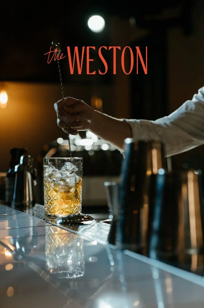
The Weston is a conceptual brand for an urban restaurant and bar. The Weston offers diverse cuisine, with seasonal products and finely selected drinks.
Role & Services
Concept
Brand design
Project category
restaurant, food + beverage, hospitality
*Please note that this is a self-initiated project. Any similarities to existing businesses are unintentional.
Section Styles sticky-left
The Goal
The Weston aims to be a place for dining, drinks, and good people. Fine dining used to mean stiff and pretentious settings. The Weston wants to join fine dining, quality food, and drinks with a casual atmosphere because great food and drinks are best shared with good company.

Section Styles sticky-right
The Approach
Warm but deep colors are combined to create a bold yet laid-back color palette. The typography is clean but has character, which exemplifies the culinary concept of The Weston.
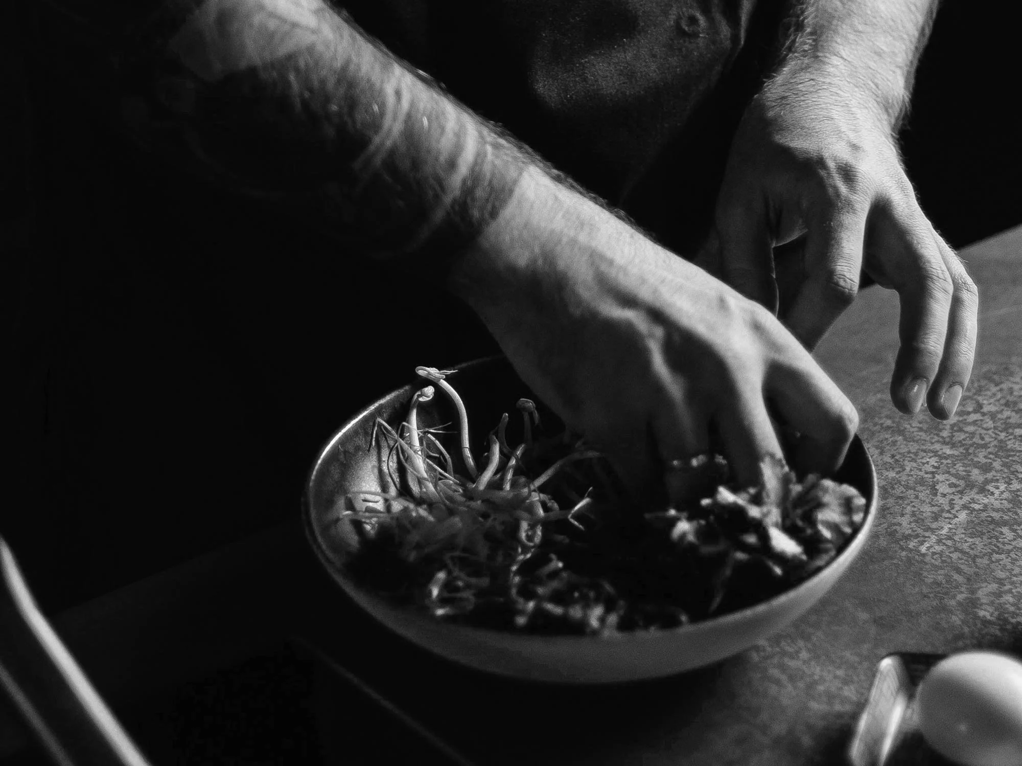
Subtle handwritten accents highlight the focus on craftsmanship, rough textures add a tactile feeling.
Section Styles sticky-left
The Brand in Use
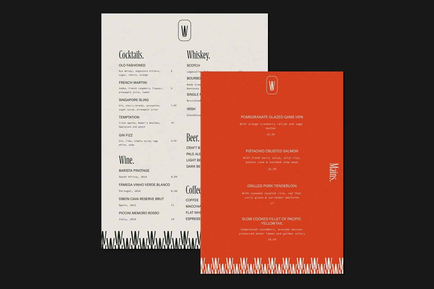
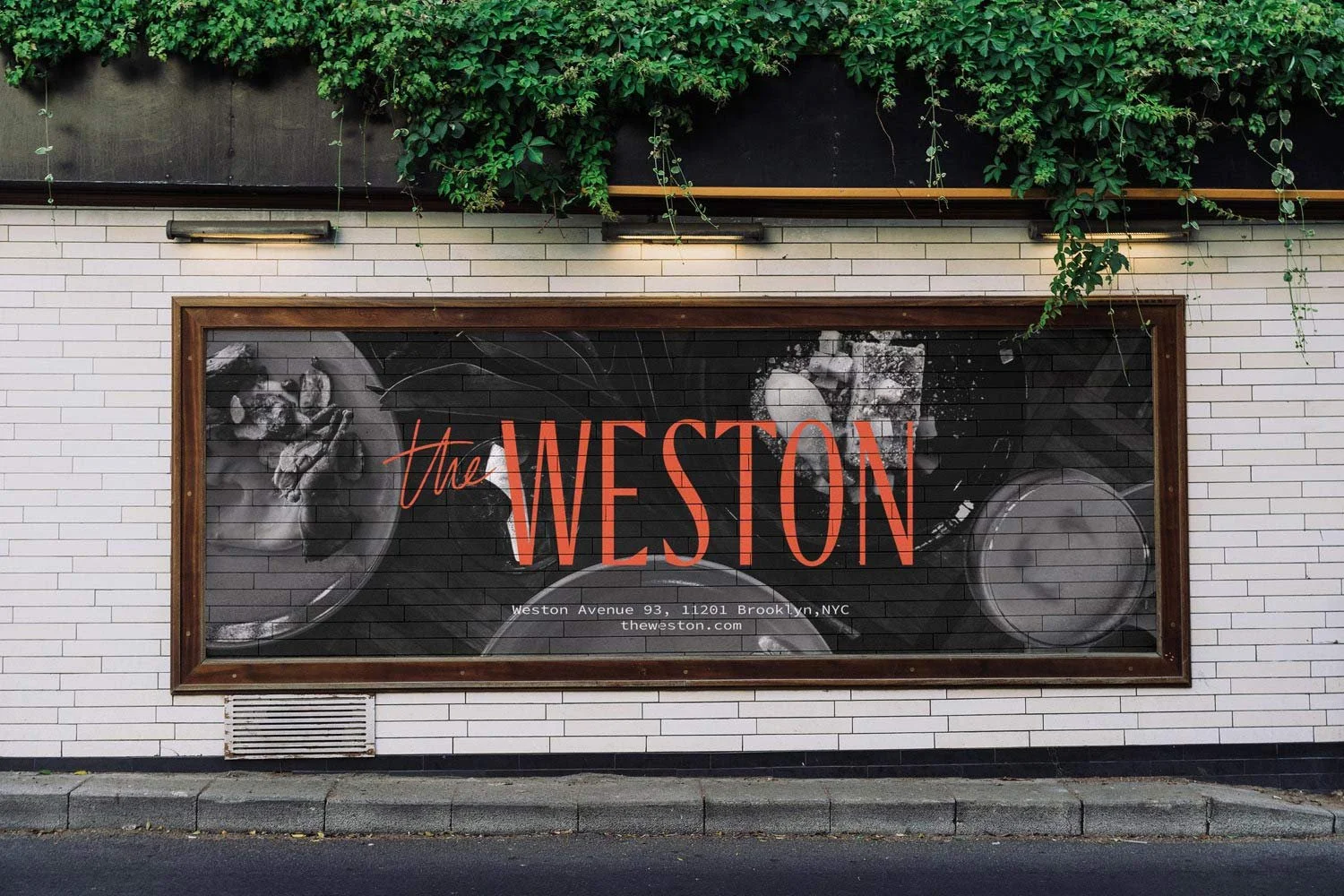
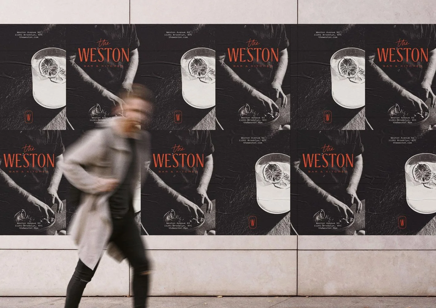
For any restaurant and bar the brand needs to be versatile for a variety of use cases from street promotion, to branded takeaway bags, to the menu. For The Weston, I envisioned the use of tactile textured papers and created a suit of versatile logos that function from a matchbox to a giant billboard on the roadside. The menu is modular and stackable for easy navigation with a dash of the unusual.
Section Styles sticky-right
The Result
The result is a brand that is bold but approachable and bridges the gap between urban chic and laid-back craftsmanship, just as the food moves between fine dining and laid-back gathering with friends.
The Weston is a place for dining, drinks & good people.

◯ Now booking


