How to create effective Brand Color Palettes
What really goes into creating a color palette that works
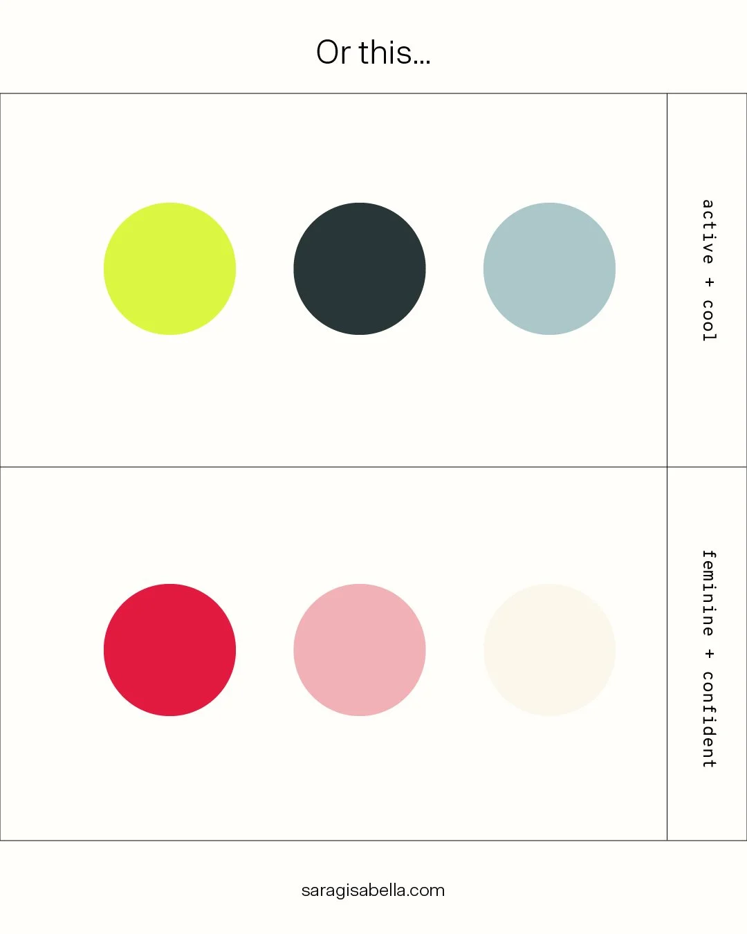
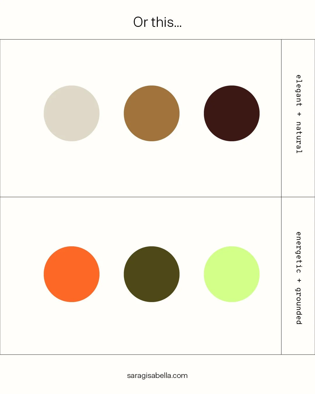
We all love these inspirational color palette posts that tell you that color XY is perfect for this type of business or creates that exact emotion. But there is so much more that goes into creating an effective color palette for your business!
Don’t get me wrong, there's nothing wrong with getting inspired. And color psychology is absolutely real and backed by science. Colors do create emotional responses. But it’s more complex than just picking an adjective from a color wheel (like the one above). Because what can very easily happen is choosing colors that are stereotypical, too trendy, and overdone in your industry. Choosing green for your sustainable business?
And of course, there are so many different shades of green – not all of them represent sustainability. Think of a harsh neon green. That screams toxic chemicals more than sustainability. Now, that doesn’t mean using green for a sustainable business is wrong per se. What I’m saying is, there’s more to choosing an effective brand color palette. So let's get into it!
There are typically 3 overarching objectives I consider when creating color palettes:
No 01/03
The Functionality
The most important thing to consider when creating color palettes is how the colors in the palette work together. You can choose the most beautiful perfect colors, but if they don’t actually work together harmoniously, it’s going to be very tough to use. The colors need to create enough contrast, for example, to be accessible and legible.
You need to think about where the colors will live. Not all colors can be printed with a regular printer, for example. So if that's something that's important to your business (or you're on a budget) you should stay away from very vibrant punchy colors like neon.
Whether my clients book web design with me or not, I typically create a rough design for a website to see how the colors work together not just with each other, but also with the typography, photography, etc. Because the colors always work in tandem with other brand elements. So often I thought I had a great color palette only to realize during this step that something wasn't quite working. Sometimes there wasn't enough contrast, sometimes there was too much contrast so it felt jarring. Sometimes I was missing a good accent color to liven things up. It takes a lot of fine-tuning that color palette tools that spit out “perfect” color palettes or inspo posts just can't provide. They can be a base, but you'll always need to do your own testing and adjusting.
Another technicality you need to consider is how to use the individual color within a palette. Some colors should be used as font color, but not as background color, for example. Not all colors are made equal within a color palette, and that's totally okay!
Example:
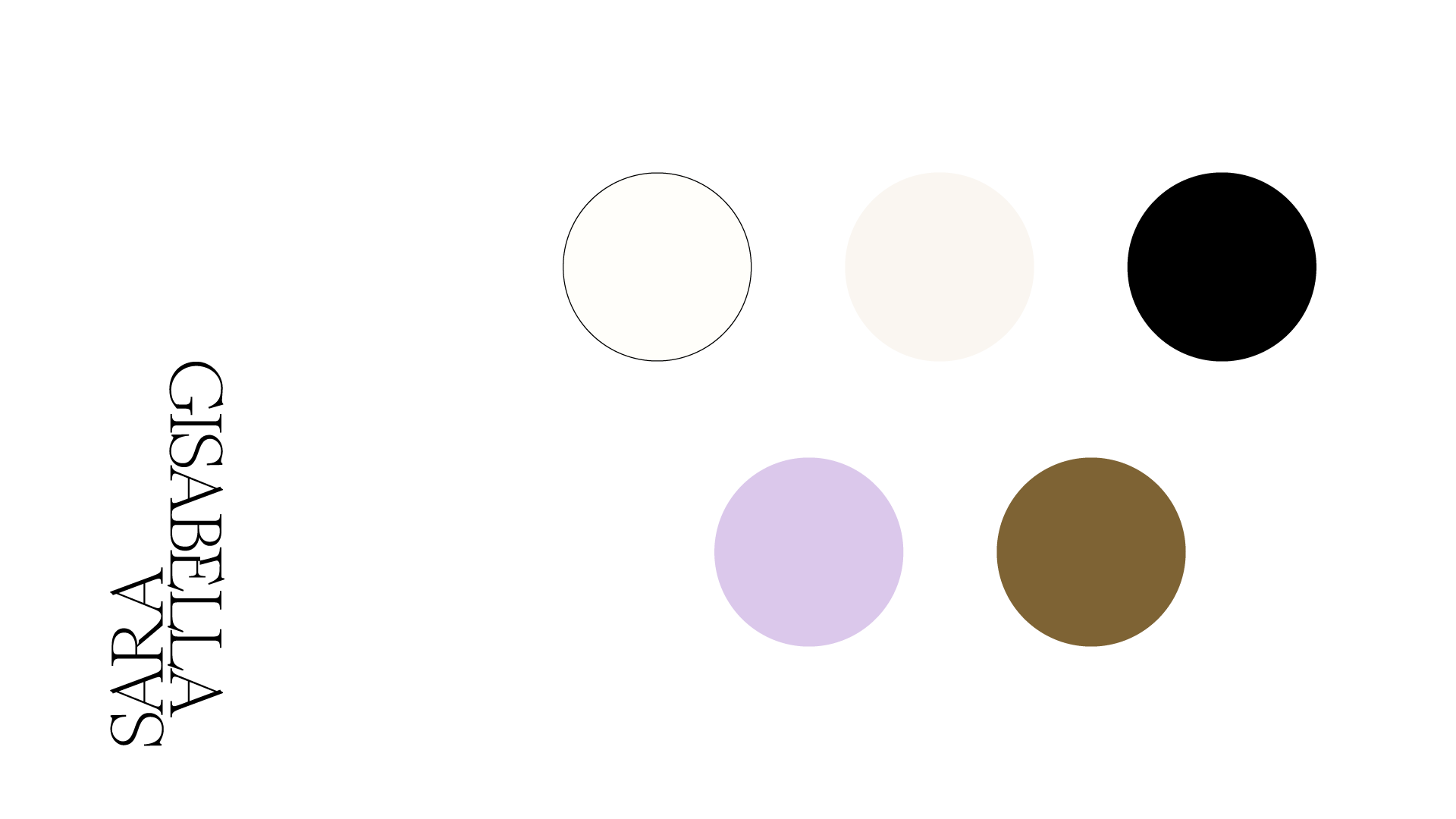
My own brand colors are rather minimal because I want my work to take the center stage. Because my designs use a variety of colors, I want my own brand colors to take a backseat and be a canvas for my work. My brand colors therefore don’t just need to work together with one another, but within the bigger context of my services. As you can see in the example below, I'm using my accent colors (the gold and the lilac) very sparingly. They are just meant to provide an additional ‘pop’, especially in places where I don't use my work or photography.
No 02/03
The Brand Story
This is the part where color psychology comes in, but there’s more to it than just choosing adjectives and emotions from a list. Your brand colors should help to paint a picture of who your brand is and what it is about. The key questions to ask are: How can the colors support the story the brand wants to tell? What is your brand personality, and how can the colors help to bring that across? Will your target audience resonate with that?
The context of your brand story also can alter the effect colors have. Two businesses could have the exact same colors, but because they are in different industries, the associations people have with these colors could be entirely different. Barbie and Telekom don't have the exact same colors, but close enough to demonstrate my point:
© Mattel
© Telekom
Not to mention that different cultures have different associations with colors. So it's important to be mindful of who your target audience is.
And it’s again important to be aware of the fact that the colors are not in isolation. How colors work together can change the entire vibe they give off and the emotional response they evoke. That's why these color psychology lists of emotions ("Red stands for passion, love, etc.") can only ever be a starting point. And not only can the combination of colors completely change their meaning, but also each shade creates subtle differences. So don't feel limited by an individual color's meaning. It's how they all come together that makes a difference.
Example:
My client Janina is a yoga and pilates teacher. At the core of her color palette are a soft lavender and a bright orange, to represent the mix of dynamic high-energy sessions she offers, and finding moments of relaxation in her customers‘ hectic daily lives. It also represents the contrasts of her gentle and nurturing but bold, and easygoing personality. Paired together, they create a fun and dynamic energy. But whenever she wants to create a relaxing and soothing atmosphere, she can focus on the lavender and pair it with the other neutral colors of her color palette. This way she can actively shape the mood depending on the needs of the moment, not by changing her color palette, but by intentionally utilizing the existing palette.
No 03/03
The Competition
Your brand doesn’t exist in a vacuum. When choosing a color palette, it’s important to consider the world it lives in: your industry.
Are there colors that are typically associated with your industry? What colors are your competitors using? I always ask myself: How can we use color to differentiate the brand from its competitors? How can we use colors to make the brand stand out visually?
That doesn’t necessarily mean steering clear of any colors that others in the industry are using by any means necessary, but it means getting creative with it and being mindful of what else your customers see when they look for what you offer. Chances are they will come across your competitors too, and by not blending into the rest, you already garner people's attention.
Example:
My clients Kari Concept offer Moroccan home decor, so authentically representing Morocco and the Amazigh culture in the brand design was key. But looking at their competitors, we saw that there were colors almost everyone in their niche uses: shades of pink, green, and terracotta. Looking at Moroccan craftsmanship and architecture, these were the obvious choices. But we wanted the brand to stand out, while still honoring the culture. I literally scrolled through hundreds of images of Moroccan landscapes, crafts and architecture and realized that none of their competitors had used another prominent color in Moroccan culture: A rich royal blue. That became the heart of the Kari Concept color palette. And instead of reddish terracotta, we leaned more into earthy brown tones. It’s a subtle but effective shift.
Conclusion
As you can see, there’s a lot more to consider when choosing colors for a brand than just a vague emotional response. It’s really both an art and a science. And it takes lots of research, experimentation, and a good amount of play to create effective color palettes that actually work.
Feel overwhelmed with choosing your color palette? Let’s work together!
You might also like


