
3 Reasons why your Logo shouldn't be too Literal
One of my entrepreneur friends recently told me that an industry leader in her niche (who is not a designer) recommended adding an “obvious” illustration to any logo, meaning an illustration that shows at a glance what you do. Think a loaf of bread for a bakery, flowing hair for a hairstylist, or a camera for a photographer. And seemingly this advice seems good, because why wouldn’t you want your audience to understand what you do with just a glance? But actually, this method can actually work against you and here are 3 reasons why:
01/03
Doppelgänger Alert
People get bored quickly when they see the same thing over and over again. So if everyone chooses the obvious for their logo there’s going to be a whole bunch of lookalike logos. Doing exactly what everyone else in your industry is doing is guaranteed to make you blend in instead of standing out.
There are certainly ways you can reinterpret and reinvent the obvious, but that takes a lot of precision, care, and creativity.

For MyVlow, a physiotherapy practice that focuses on pelvic floor health, I was inspired by the shape of a pelvic floor (that also looks like a butterfly). But instead of going with something very on the nose, I abstracted the shape into a minimal geometric illustration that stands out from their competition. It’s a subtle nod, and sometimes that’s all that’s needed.
Much more important is that your logo conveys the vibe and the quality of what you do. Just because a logo is literal, doesn’t mean it communicates that.
02/03
Your Logo doesn’t exist in Empty Space
Give your audience some credit. They don’t need a loaf of bread to tell them it’s a bakery. A well-crafted logo can speak volumes without hitting them over the head with the obvious. Especially because logos are rarely seen out of context. Think about where you usually see logos: on packaging, on websites, on merchandise, business cards, flyers and other promotional materials. You very rarely see a logo in isolation, so in most cases the logo doesn’t even need to show what you do.
Your logo’s a hero, but it can’t and shouldn’t do it all. Putting the weight of your entire brand on a single logo illustration is incredibly reductive and limiting. Instead, start seeing your logo as a team player. To be successful it needs to work in tandem with the rest of your design (fonts, colors, etc.), with your photography and your words. Your logo doesn’t have to do all the heavy lifting.
And let’s be real, these types of logos are supposed to convey the obvious without additional context, but do they really achieve that? Does a paint brush in your logo mean you’re an artist, or that I can hire you to paint my house, or do you sell brushes? Who knows. Without context, it can still mean a whole lot of different things. So we still need context either way.
Instead of trying to make your logo do it all, make sure it’s responsive. It needs to be adaptable for different spaces, from a tiny social media profile picture to a giant billboard. Learn more about responsive logos here.
03/03
Many Brands you love don’t do it
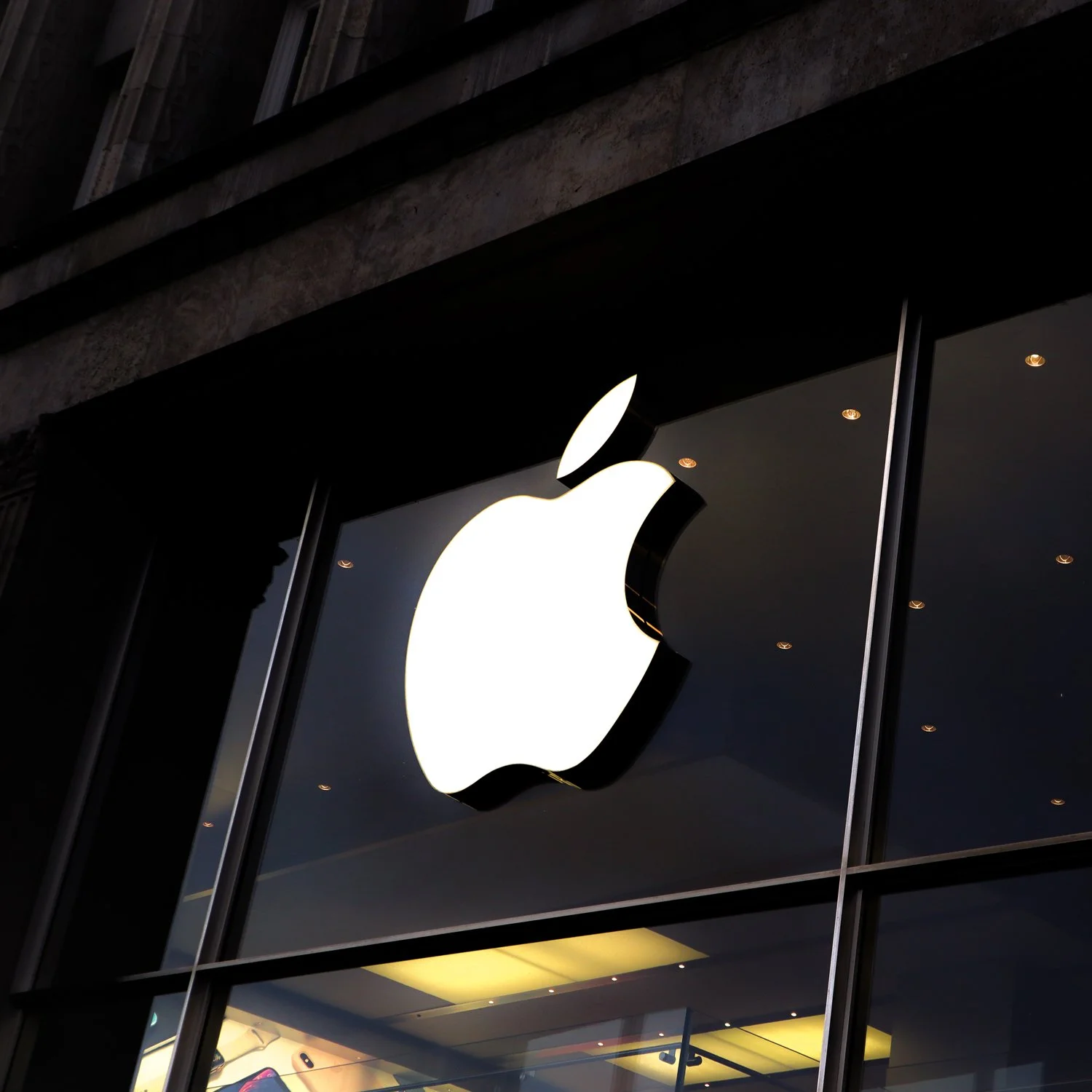
Ever noticed that some of the coolest brands out there rock logos that go beyond the literal? Let’s take a page from the big players: Apples don’t have anything to do with the products Apple sells. The iconic Nike swoosh is just an abstract symbol. Burberry doesn’t actually sell medieval armor (which arguably would be very cool). Lacoste doesn’t sell crocodiles (at least as far as I’m aware). A lot of brands don’t use any illustration at all. Think Chanel, Google, Coca-Cola. The list is endless.
Think about your own personal favorite brands, no matter how big or small. How many of them are obvious and literal with their logos? Probably not too many…
Now that doesn’t mean a literal logo isn’t possible. Burger King is a good example of a literal logo that works. But it actually takes a lot of out of the box thinking to make it work well. There’s not just one right way to create a logo that works for every brand. Some brands have wonderfully illustrated logos, some are just type, some combine both. There’s no simple recipe to create an effective logo that works for your brand.
Conclusion
Logos come in a wide variety, and that is a good thing! Doing what everyone else in your industry is doing is making it so much harder for your audience to notice you. And remember, your logo isn’t the be-all and end-all of your brand design. It usually lives within context, so your logo doesn’t have to do everything.
Need help with creating a Brand Design that stands out?
Disclaimer: All logos displayed here belong to their respective owners and are displayed for demonstration purposes only.
You might also like


