Why you need Logo Variations for your Brand
A lot of people think that all they need for their brand is a single Logo. And while a logo sure is an important feature of a brand design, it won’t prepare you to represent your brand professionally in all circumstances. So today I’m going to show you the different types of logo variations you need to have for a versatile brand that equips you for all possible situations!
The Primary Logo
This is the type of logo everyone thinks of. It’s the main logo for your brand and usually it is the most intricate. It usually contains the full name of your business, but it can also contain a tagline or, in the example below, an illustration.
The Secondary Logo
The secondary logo is usually an abridged or rearranged version of the primary logo. It takes (some or all) elements of the primary logo and rearranges them for a different format, so it fits in different places.
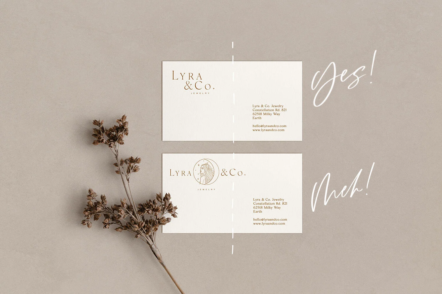
In this example, I left out the illustration. It is quite an intricate illustration for a logo, so it won’t work on very small print, for example. So this variation can be used instead. But also the layout of the primary logo is horizontal and sometimes you just don’t have the space to use it without making it too small. That is why the secondary logo has a more vertical layout so it can go into tighter spaces, while still being legible and looking good.
Do you see the difference? The top layout has room to breathe, symmetry and balance. The bottom is off balance and it’s looking slightly awkward. Also keeping in mind that business cards are tiny, the illustration would probably not print well.
Submarks & Monograms
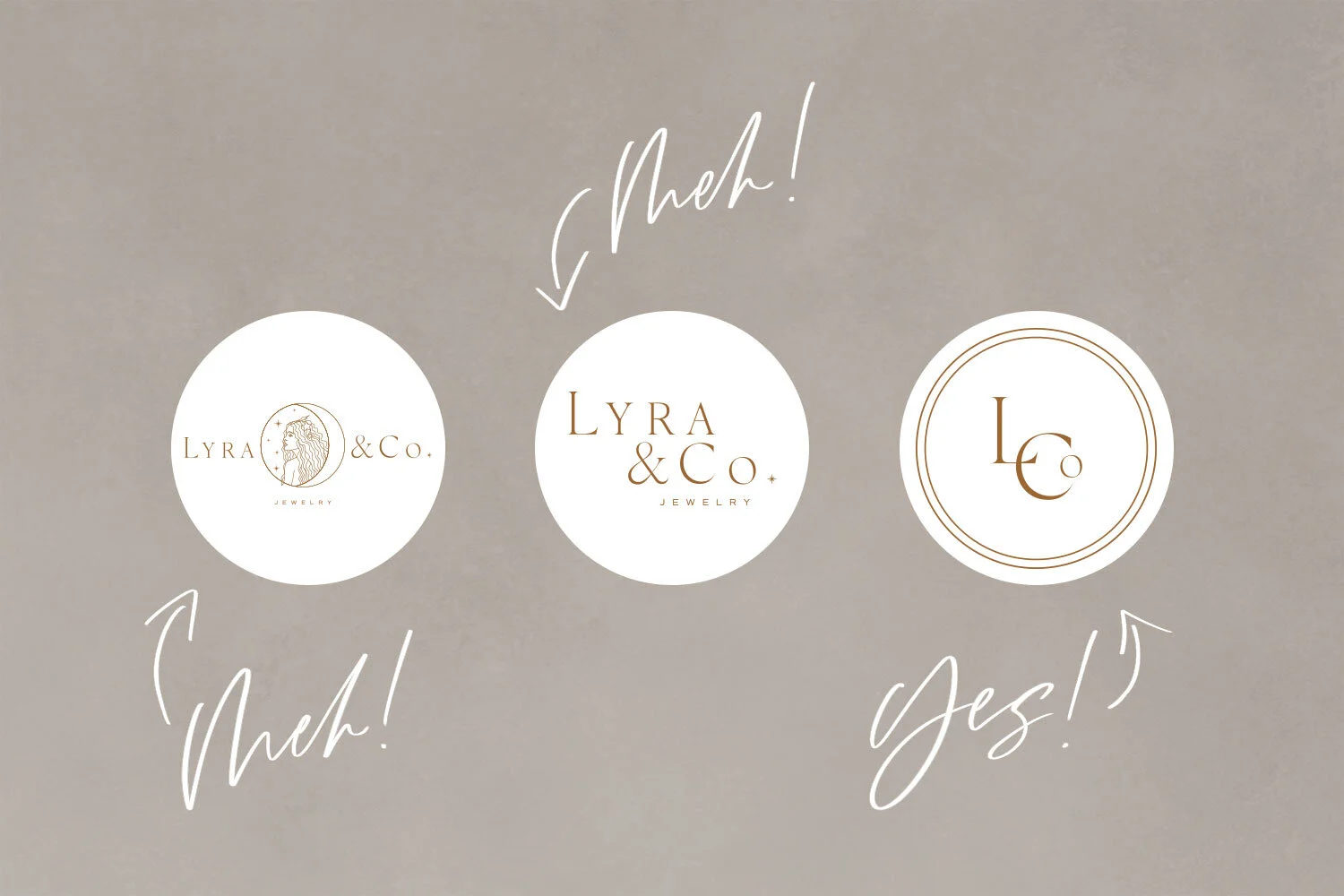
Sometimes even the secondary logo is too big to fit or doesn’t have the right layout. You don’t want your logo to look cramped. So instead of forcing your logo into that space, your brand designer should give you these variations so your logo adapts to the space! Look at these social media icons for example. Social media icons are often small and round, so the primary and secondary logo can look really cramped and awkward. That’s where submarks come in!
Submarks can be monograms, taking the initials of your business name, but they can also be an illustration or other element of your brand identity (part of a pattern for example) or a combination. Sometimes it can make sense to create multiple submarks for one brand too, to give some variety. They can be used whenever you can’t or don’t need to use your full logo (for example, on running pages of printed materials). They just allow you to add your branding in a more playful, but also more subtle way. For example, they can be used for website footers, favicons, stickers, watermarks, social media icons, secondary pages of printed materials, product packaging, and all sorts of other spaces. These are the most versatile logo variations because they can basically work everywhere.
Logo variations make your brand look the best in every situation.
So as you can see, all of these variations have a purpose and a space in which they work best. They make your brand look professional in every situation and give you a toolkit for using them for web, print, packaging, stationery and whatever else you might need. And although each piece is different, they all work together and give your brand a cohesive and recognizable look.
Take this packaging for example: The primary logo has plenty of space to breathe on the packaging. But for the sticker, I used a submark to give that little extra touch.
If you’re ready to transform your business with a cohesive brand, let’s chat!
◯ YOU MIGHT ALSO LIKE


